UI Responsive Design - Breakpoint

Card Puncher Data Processing

About

layouts are responsive (ie change) at what is called breakpoint.

Use line measures as a factor for picking breakpoint.

Android Screen Buckets

where: Computer Display - Device Independent Pixel (DIP)

Viewport

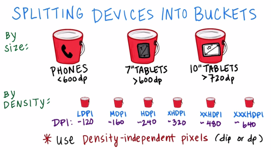
viewport example (ie the size of the display device)

  • Ipad: 768 pixel
  • Ipad Pro: 1024 pixel
  • Iphone 5/SE: 320 px
  • Iphone 6/7/8: 375
  • Galaxy S5: 360

Example

Documentation / Reference


Discover More
Bootstrap - Breakpoint (Toggle)

in Bootstrap Code Name Display Device Description Toggle Size xs (Default) extra small Bootstrap Default <576px sm small Small devices (landscape phones) < 768px md medium tablets ...
CSS - Responsive (Breakpoint)

responsiveness in CSS An element that defined the width: as percentage or fix with a max-width property in percentage generally equal or below 100% Example: Bootstrap use media queries to create...
Responsive HTML image with the srcset attribute

How to delegate the choice of an image to the browser with the srcset attribute.
Card Puncher Data Processing
UI - Responsive Design

Responsive UI design means designing an application by keeping in mind that he'll be used on a range of device screen with different sizes. Responsive layouts in material design adapt to any possible...
On Off Automaton
UI - Toggle or Collapse (Display or hide elements) (On/Off)

Display or hide UI components. “”|“”O |OSPAimes/status/907487309142126592Twitter Generally toggle activity, when using a responsive design appears to what is called breakpoints: Display...


Share this page:
Follow us:
Task Runner