About
Storybook is a component workbench where you write story.
A story is a single state of your component. Technically, it is a function that returns something that can be rendered to screen.
UI component dev & test
Articles Related
Model
There are two basic levels of organization in Storybook:
- the component (ie the javascript file in the stories directory)
- and its child stories. (ie the exported function in the file)
Each story is a different instance of a component. You can have as many stories per component
Component
the default export defines metadata about your component:
- including the component itself,
- its title (where it will show up in the navigation UI story hierarchy),
- decorators,
- and parameters.
export default {
    component: Task,
    title: 'Task',
    id: 'Foo/Bar', // or 'foo-bar' if you prefer
    // Our exports that end in "Data" are not stories.
    excludeStories: /.*Data$/,
    decorators: [ ... ],
    parameters: { ... }
};
where:
- id [Optional] is the id of the component/group (Doc)
- title is the path/name of the component - title should be unique, i.e. not re-used across files.
id chosen is:'
- id if present
- otherwise title ?
Ref doc: Default export doc
Story
export const Baz = () => <MyComponent />;
Baz.story = {
   name: 'Moo',
   parameters: {
       notes: 'popover tooltip'
   },
};
where:
- name is the name of the story
- notes are tag for the search engine
id of a story is:
- the name if present
- otherwise, the export key
Url Path of a story is:
?path=/story/groupId--storyId
# example
?path=/story/foo-bar--baz
Hierarchy
Stories can be organized in a nested structure using / as a separator in the group title. Doc
export default {
  title: 'Design System/Atoms/Checkbox',
};
Configuration ShowRoots
import { addParameters } from '@storybook/react';

addParameters({
  options: {
    /**
     * display the top-level grouping as a "root" in the sidebar
     * @type {Boolean}
     */
    showRoots: false,
  },
});
Installation/Configuration/Getting Started
Install
- Init
npx -p @storybook/cli sb init
Old way was ….
yarn add @storybook/react --dev
#or
npm install @storybook/react --save-dev
Start
- Config the start
"scripts": {
    "storybook": "start-storybook -p 9009 -s public"
  }
- and Start
yarn storybook
Configure
Create the configuration file Doc
Where to find stories
Minimal: stories is a list of glob patterns that tells where the stories are located, relative to the configuration file.
module.exports = {
  stories: ['../src/components/**/*.stories.js'],
};
Addon Preset
module.exports = {
  stories: ['../src/components/**/*.stories.js'],
    addons: ['@storybook/preset-create-react-app','@storybook/addon-actions', '@storybook/addon-links'],
};
Story
- Develop your stories
import React from 'react';
import { storiesOf } from '@storybook/react';
import { Button } from '@storybook/react/demo';

// There is two stories (.add)
storiesOf('Button', module)
  .add('with text', () => (
    <Button>Hello Button</Button>
  ))
  .add('with emoji', () => (
    <Button><span role="img" aria-label="so cool">😀 😎 👍 💯</span></Button>
  ));
You may also locate them closer to components.
•
└── src
    └── components
        └── button
            ├── button.js
            └── button.stories.js
Run the Storybook
- Run the Storybook
npm run storybook
Add-on
https://storybook.js.org/addons/introduction/#2-native-addons
Action
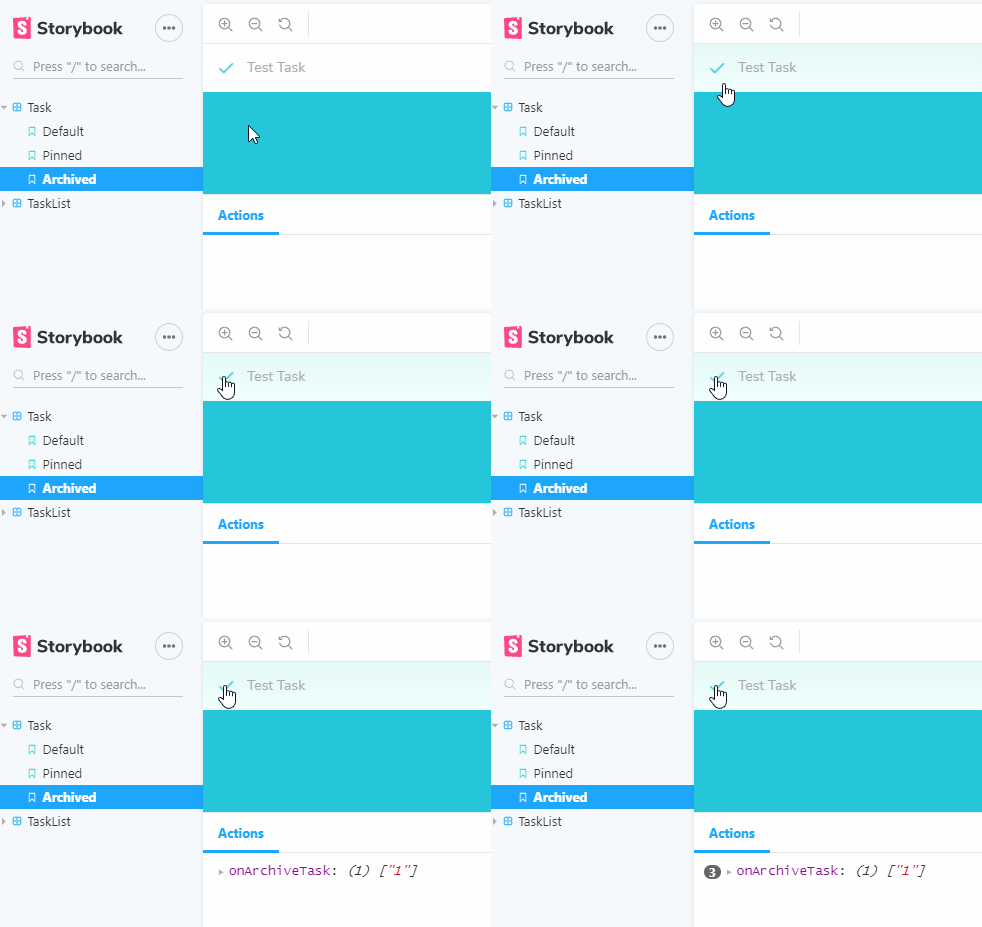
Action is storybook native addons that permits to capture interaction via mocked callbacks called Actions
The callback appears in the actions panel of the Storybook UI when clicked.
So for instance when we build a pin button, we’ll seen it in the action panel.
Centered
yarn add @storybook/addon-centered --dev
Storyshot
With a snaphost test for each of our Task stories, if we change the implementation of Task, we’ll be prompted to verify the changes.
- install: storyshots for / and test-renderer
yarn add -D @storybook/addon-storyshots react-test-renderer
- config
import initStoryshots from '@storybook/addon-storyshots';
initStoryshots();
- Test
yarn test
# ie react-scripts test
PASS  src/storybook.test.js (7.372s)
  Storyshots
    Task
      √ Default (14ms)
      √ Pinned (1ms)
      √ Archived (2ms)

 › 3 snapshots written.
Snapshot Summary
 › 3 snapshots written from 1 test suite.

Test Suites: 1 passed, 1 total
Tests:       3 passed, 3 total
Snapshots:   3 written, 3 total
Time:        8.015s
Ran all test suites related to changed files.
- if the snapshot change, the test will output:
› 3 snapshots failed from 1 test suite. Inspect your code changes or press `u` to update them.
Decorators
Decorators are a way to provide arbitrary wrappers to stories.
They can be used to:
- add some padding around the rendered component.
- wrap stories in “providers” –i.e. library components that set React context.
Searching
Doc search results will show up based on:
- the file name / id
- notes Doc
Example of story with notes.
export const callout = () => <Callout>Some children</Callout>;
callout.story = {
parameters: { notes: 'popover tooltip' },
};
