
About
Display or hide UI components.
The power icon on all electronics, the line though a circle is actually binary, 1 is on, 0 is off. On a toggle switch the “on” side is marked with a | and the “off” side with a O A combined version with | fully superimposed on the O means a single button that toggles on/off
Toggle size: breakpoints
Generally toggle activity, when using a responsive design appears to what is called breakpoints:
Example
Jquery
Display or hide the matched elements. http://api.jquery.com/toggle/
div, button {
  margin: 0.5rem;
}
<button id="clickme">
  Click me and the Ipsum will appear/disappear
</button>
<br/>
<button id="clickmeslowly">
  Click me and the Ipsum will appear/disappear <b>slowly</b>
</button>
<br/>
<div id="ipsum" width="100" height="123">
Lorem ipsum dolor sit amet, consectetur adipiscing elit, sed do eiusmod tempor incididunt ut labore et dolore magna aliqua.
Ut enim ad minim veniam, quis nostrud exercitation ullamco laboris nisi ut aliquip ex ea commodo consequat.
Duis aute irure dolor in reprehenderit in voluptate velit esse cillum dolore eu fugiat nulla pariatur.
Excepteur sint occaecat cupidatat non proident, sunt in culpa qui officia deserunt mollit anim id est laborum.
</div>
$( "#clickme" ).click(function() {
  $( "#ipsum" ).toggle();
});
$( "#clickmeslowly" ).click(function() {
  $( "#ipsum" ).toggle( "slow", function() {
    // Animation complete.
  });
});
Bootstrap
bootstrap Collpase plugin (based on Jquery)
where:
- data-toggle is a custom bootstrap data attribute that store the type of widget.
data-toggle="modal"
data-toggle="collapse"
data-toggle="dropdown"
data-toggle="tab"
- data-target stores the element id to toggle.
Example collapse
<p>
  <a class="btn btn-primary" data-toggle="collapse" href="#collapseExample" aria-expanded="false" aria-controls="collapseExample">
    Link with href
  </a>
  <button class="btn btn-primary" type="button" data-toggle="collapse" data-target="#collapseExample" aria-expanded="false" aria-controls="collapseExample">
    Button with data-target
  </button>
</p>
<div class="collapse" id="collapseExample">
  <div class="panel panel-default">
    Anim pariatur cliche reprehenderit, enim eiusmod high life accusamus terry richardson ad squid. Nihil anim keffiyeh helvetica, craft beer labore wes anderson cred nesciunt sapiente ea proident.
  </div>
</div>
Example dropdown: Menu
<!-- An container element with the class dropdown is needed.
Without it, the dropdown-menu elements are going all the way down -->
<div class="dropdown">
  <a href="#" data-toggle="dropdown" class="dropdown-toggle">
      <span class="glyphicon glyphicon-user"></span>
      <b class="caret"></b>
  </a>
  <ul class="dropdown-menu">
	<li>
	  <a href="/users/id" title="Profile">Profile</a>
	</li>
	<li>
	  <a href="/logout" title="Logout">Logout </a>
	</li>
  </ul>
</div>
Related to UI - DropDown
Pure Javascript - Toggle a list
- The css
/* The element with the toggle class are not shown */
.toggle {
  display: none;
}

/* The button with the hide id also */
#hide {
   display: none;
}
- The Html with:
- 5 elements in the list
- and two control buttons respectively Show and Hide
<ul>
  <li>First</li>
  <li>Second</li>
  <li>Third</li>
  <li class="toggle" >Fourth</li>
  <li class="toggle" >Fifth</li>
  <li  id="show" onclick="listManager(event, 'show')" >Show</li>
  <li  id="hide" onclick="listManager(event, 'hide')" >Hide</li>
</ul>
- The Javascript that is called when clicking on the controls
function listManager(evt, elementId) {
  // Declare all variables
  var i, toggleElements, display;

  if (elementId=='show') {
      document.getElementById('show').style.display = "none";
      document.getElementById('hide').style.display = "list-item";
      display = "list-item";
  } else {
      document.getElementById('show').style.display = "list-item";
      document.getElementById('hide').style.display = "none";
      display = "none";
  }

  // Get all elements with class="toggle" and hide them
  toggleElements = document.getElementsByClassName("toggle");
  for (i = 0; i < toggleElements.length; i++) {
    toggleElements[i].style.display = display;
  }

}
- A Click on the Show Link will show the last 2 elements and the Hide link
- A Click on the Hide Link will hide the last 2 elements
Finite Automaton
A ''on/off' button modeled as a finite automaton.
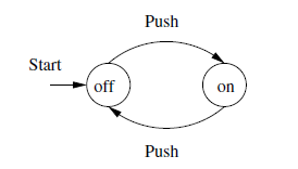
It has only two states.