About
This page shows some metrics that can be calculated on a graphic in order to scan their pertinence.
Articles Related
List
Inkt Ratio
<MATH> \text{Data-ink ratio} = \frac{\displaystyle \text{Ink used to describe the data}}{\displaystyle \text{Ink used to describe everything else}} </MATH>
- Low is bad
- High is good
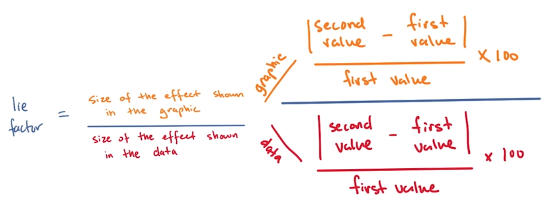
Lie Factor
<MATH> \text{Lie Factor} = \frac{\displaystyle \text{Size of the effect shown on the graphic}}{\displaystyle \text{Size of the effect shown in the data}} </MATH>
Good interval is: <MATH> 0.95 < \text{Lie Factor} < 1.05 </MATH>