Data Visualization - Line Chart

Utah Teapot

About

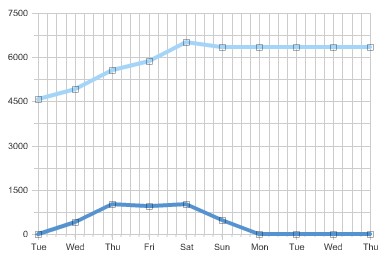
Line chart shows quantities:

Line graphs are useful for showing:

Can be used to plot multiple (variables|measures)
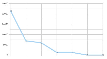
Example

Obiee 10g Time Series Line Obiee 10g Graph Line

Styles

  • Standard Line
  • Stepped Line
  • Curved Line

Shading the the area between the line and the scale, draw attention to changes in the data.


Discover More
Top 5 Browsers
Data Visualisation - Area Chart

An area chart shows the trend of the contribution of: each value over time or by category. It is basically a line graph for which the regions between lines are filled in. Regions stack, adding...
Utah Teapot
Data Visualization - ( Chart | Graph | Graphic)

A chart, also called a graph (in mathematics for instance), is a graphical representation of data, in which the data is represented by symbols, such as: bars in a bar chart, lines in a line chart,...
Utah Teapot
Data Visualization - Visual (or Mark)

A visual is an object created from visual primitive that gets the value of its properties from the data. See also: Visual Encoding Bar (ie rectangle) Point (ie Circle or Square) Line Area...
Utah Teapot
Data Visualization Foundation

The Utah Teapot. Data visualization is the process of mapping quantitative data to visuals (shapes, color, position, etc) to create a graph made of geometric object. Information visualization: ...
Obiee Graph Line
OBIEE 10G/11g - (Chart|Graph) View

A graph view displays numeric information visually, which makes it easier to understand large quantities of data. For displaying a single data value, a gauge is often more effective than a graph. Graphs...
Card Puncher Data Processing
Plotly - Line and Scatterplot (Plot|Chart)

Line and Scatterplot


Share this page:
Follow us:
Task Runner