About
A graph view displays numeric information visually, which makes it easier to understand large quantities of data. For displaying a single data value, a gauge is often more effective than a graph.
Graphs often reveal patterns and trends that text-based displays cannot.
However, when precise values are needed, graphs should be supplemented with other data displays, such as tables.
A graph is displayed on a background, called the graph canvas.
All graph types with the exception of scatter and radar graphs can be 2-dimensional (2D) or 3-dimensional (3D). Not all types of graphs are appropriate for all types of data.
Articles Related
Type
Bar
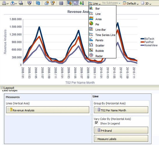
Line
Area
Pie
Shows data sets as percentages of a whole.
Pie graphs are useful for comparing parts of a whole, such as sales by region or by district.
Styles:
- Solid Fill
- Gradient Fill
- Pattern Fill

Line-Bar
Subtypes available:
- Standard
- Stacked
Plots two sets of data with different ranges, one set as bars, and one set as lines overlaid on the bars.
Line bar graphs are useful for showing trend relationships between data sets.
Styles:
- Rectangle
- Triangle
- Cylinder
- Diamond
- Gradient
- Pattern Fill
Restrictions:
- You cannot drag and drop measure labels.
Time Series Line
Plots time series data. It scales the horizontal axis based on the time that has elapsed between data points.
A time series line graph requires a single date or date-time data column to be selected on the horizontal axis. It has a single vertical axis, but supports multiple data series.
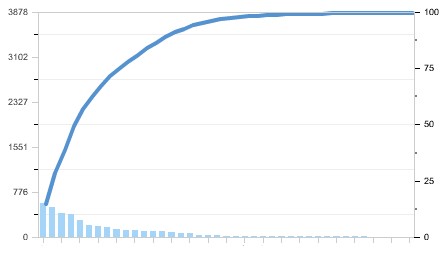
Pareto
Is a form of bar graph and line graph that displays criteria in descending order. In this graph type, the line shows a cumulative total of the percentages.
Pareto graphs are useful for identifying significant elements, such as best and worst or most and least.
Styles:
- Rectangle
- Triangle
- Cylinder
- Diamond
- Gradient
- Pattern Fill
Restrictions:
- A pareto graph can have only one measure.
Scatter
A scatter graph requires at least two measures. For example, you can plot one measure column on the horizontal axis and another measure column on the vertical axis. These measures are plotted for values on the Group By axis.
Styles:
- Standard Scatter
- Scatter-with-Lines
Bubble
Is a variation of a scatter graph that displays data elements as circles (bubbles). It shows three variables in two dimensions. One value is represented by the location of the circle on the horizontal axis. Another value is represented by the location of the circle on the vertical axis. The third value is represented by the radius of the circle.
Bubble graphs are useful for:
- plotting data with three variables,
- and displaying financial data over a period of time.
Restrictions:
- A bubble graph requires at least three measures. Plot one measure on the horizontal axis, another measure on the vertical axis, and a third measure on the bubble size axis.
- you cannot drag and drop measure labels.
Radar
Plots the same information as a bar graph, but instead displays data radiating from the centre of the graph. Each data element has its own value axis.
Radar graphs are useful for examining overlap and distribution.
Logarithmic scale
In 11G, the logarithmic scale behaves in the following ways:
- If you specify the scale limits, then the scale limits for the logarithmic scale must be powers of 10 only. If the number that you specify is not an exact power of 10, then the power of 10 closest to the number that you specify is used.
- If you let the system determine the scale, then the lower limit changes dynamically based on the measure used.
In previous releases, the logarithmic scale behaved in the following ways:
- If you specified the scale limits, then the scale limits for the logarithmic scale were numbers fully divisible by 10. If the number that you specified was not divisible by 10, then the number closest to the number that you specified that was fully divisible by 10 was used.
- If you let the system determine the scale, then the lower limit always started at 1 and the upper limit changed based on the measures used.
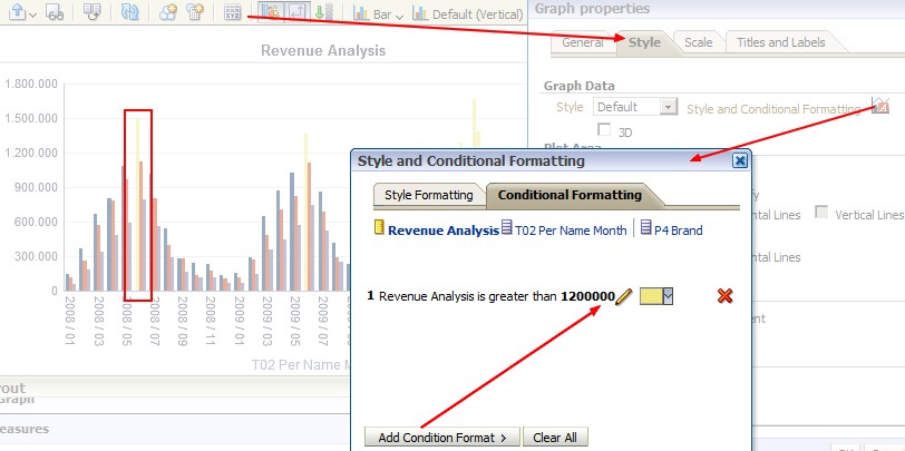
Conditional formatting
Conditional formatting enables you to customize the appearance of a graph based on conditions applied to columns. The formatting is applied to the column values that meet the condition.
You can specify a color in which to display graph data based upon a specific column value, or range of column values that meet the condition specified for the column.
11G:
10G:
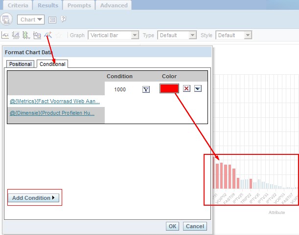
For example:
- Conditionally changing the color of a graph based on specific column values.
A user wants to create a bar graph to compare sales between two beverages, Lemonade and Cola. When creating a bar graph the user specifies two conditions, one where the bar representing Lemonade sales is yellow, and another where the bar representing Cola sales is blue.
- Conditionally changing the color of a graph based on a range of column values.
A sales manager wants to create a bar graph to compare sales for all reps across two sales bands.When creating a bar graph the sales manager specifies two conditions, one where the bar is red for all sales reps with sales less than 250,000, and another where the bar is green for all sales reps with sales greater than 250,000.
Sort Order
In 11g, it is not possible to sort data in a graph using a column that is not included in the view. You have to add the column in the view (and hiding it required) to apply the sort order